Goodbudget Way
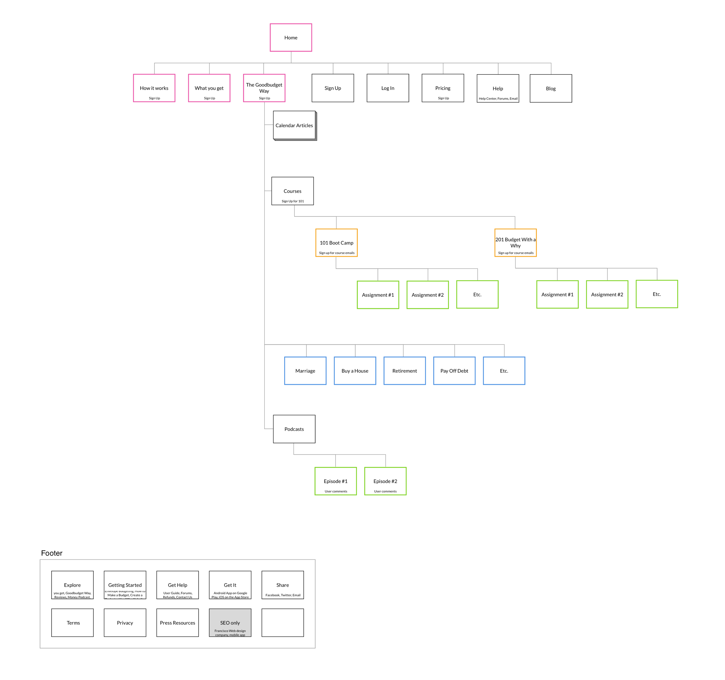
A hub page that organizes all evergreen content created over the years for easy perusal.
Goodbudget started out as a little budget tracker tool and grew up to be Goodbudget “the brand,” with a clear philosophy on how to spend, save, and give in line with one’s values.
Problem
In addition to the need for a new look-and-feel, Goodbudget needed a space to organize and surface all of the new content types so that they were easy to browse. The marketing team had been creating evergreen content including articles, podcasts, videos, and courses that were getting published on as new blogposts, which meant that they would be demoted with each new post.
OBJECTIVE
Design a hub for budgeters to peruse all Goodbudget content and encourage registering for newsletters, courses, and installing the Goodbudget app.
-

Before
Evergreen content was shared through the blog feed only, so older posts would get demoted with each new post.
-

After
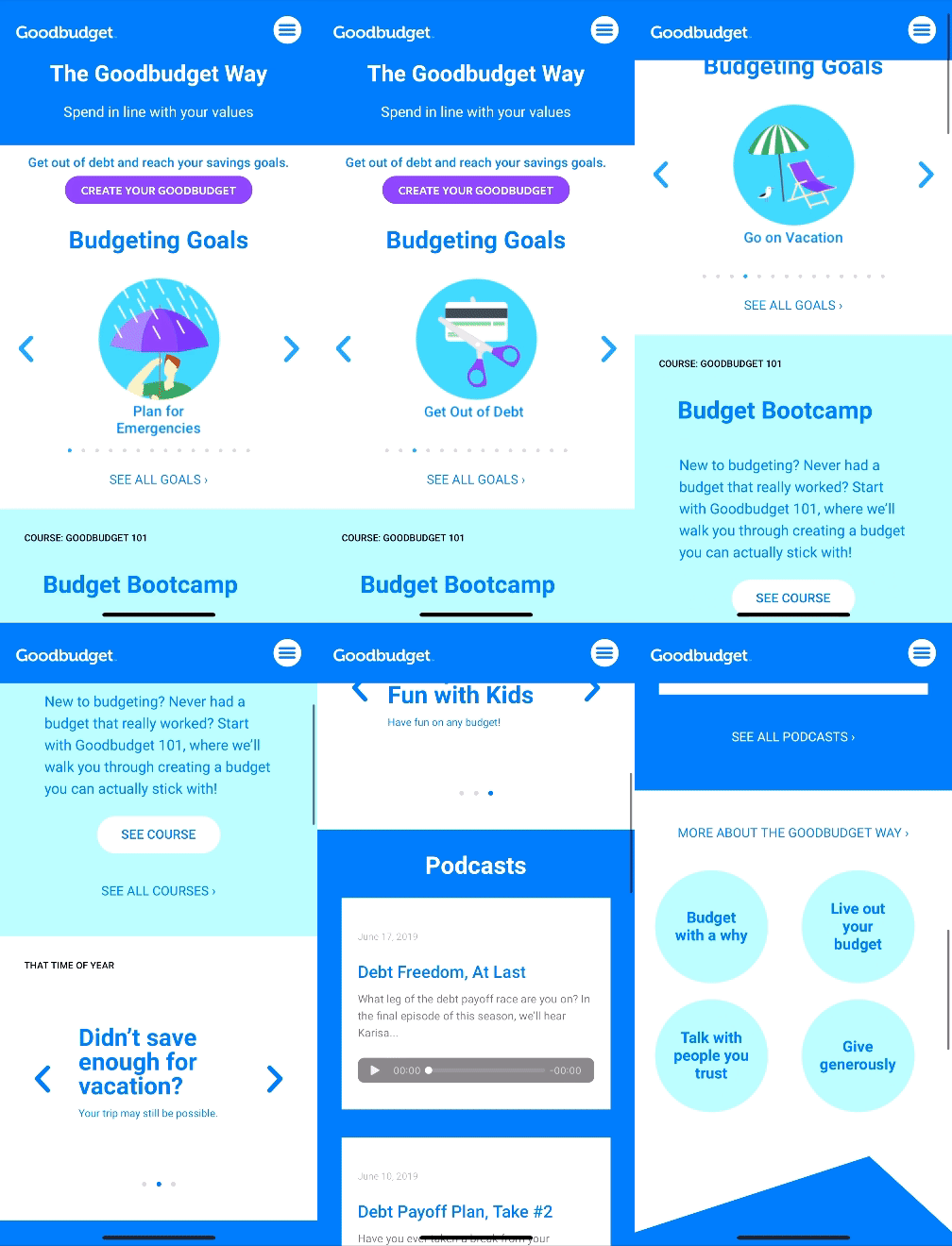
Organized evergreen content on a dedicated page called “The Goodbudget Way” to allow browsing by topic or type. The “time of year” carousel surfaces content that is relevant for the current season like taxes in spring or holidays at the end of the year.
Among new users, the audience is 55% desktop and 45% mobile so I optimized the experience for both platforms.RESULTS
The Goodbudget Way page encouraged further browsing after users were linked to a specific page from an email or internet search. There were sustained page views on articles and videos that were published months and even years ago.
We started tracking conversions rates for subscribing to Goodbudget Courses and registering for the Goodbudget app to gather data after launch. I recommended A/B testing upsell copy and position on the page as the next step.
See the Goodbudget Way live.


